To combine colors like a pro, start with the fundamentals of the color wheel, understanding primary, secondary, and tertiary hues. Use color schemes like complementary for contrast, or analogous for harmony, and consider color temperature to set mood—warm tones energize, cool tones calm. Practice blending and mixing to create unique shades that enhance your designs. Keep exploring these principles to master the art of effective color combinations and create visually appealing work.
Key Takeaways
- Understand the color wheel, primary, secondary, and tertiary colors to create balanced, harmonious palettes.
- Use color schemes like complementary, analogous, and triadic to achieve visual contrast and cohesion.
- Consider warm and cool tones to evoke specific moods and set the desired atmosphere.
- Practice mixing primary colors in various ratios to develop unique, vibrant secondary and tertiary hues.
- Apply principles of color harmony and contrast to guide your choices and enhance visual interest effectively.
Understanding the Color Wheel and Primary Colors

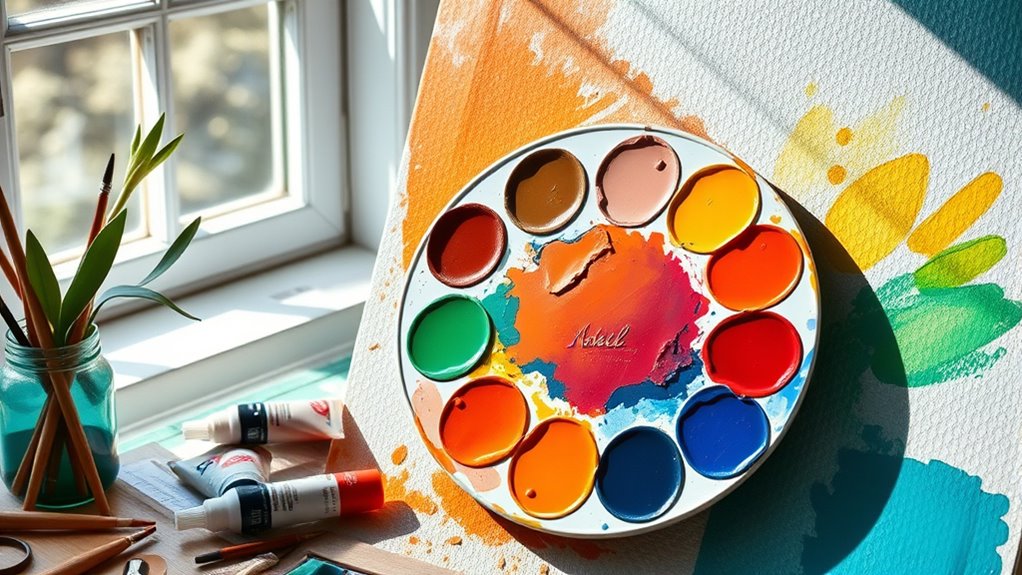
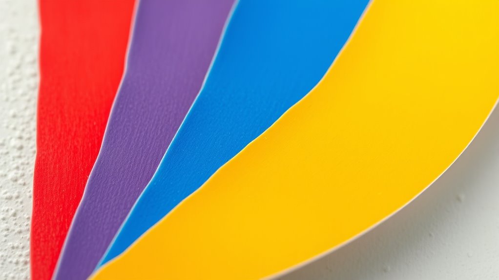
The color wheel is a fundamental tool that visually organizes colors based on their relationships. As you look at it, you’ll notice the three primary colors—red, yellow, and blue—placed evenly around the circle. These are the building blocks of all other colors because you can’t create them by mixing other hues. Red often conveys energy and passion, yellow symbolizes happiness and optimism, and blue suggests trust and stability. Understanding these primary colors helps you grasp how secondary and tertiary colors are formed. When you mix primary colors, you get secondary colors like orange, green, and purple. The color wheel makes it easy to see how colors interact, helping you choose harmonious combinations for your designs.
Exploring Secondary and Tertiary Colors for Dynamic Palettes

You can create vibrant palettes by mixing primary colors to produce secondary and tertiary hues. Experimenting with these combinations allows you to develop a wide range of color variations for different moods and effects. Using colors creatively helps you craft dynamic, eye-catching designs that communicate your intended message clearly. Incorporating color harmony principles ensures your combinations are visually appealing and balanced.
Mixing Primary for Secondary
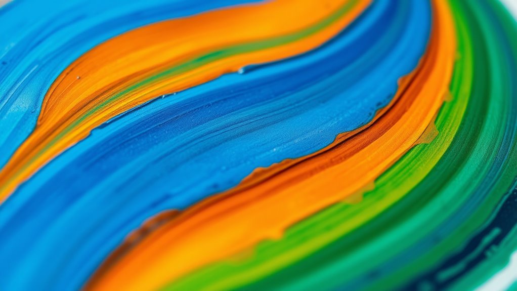
Have you ever wondered how secondary colors are created from primary hues? When you mix two primary colors, you generate a vibrant secondary color. For example, combining red and yellow produces orange, which energizes your palette with warmth. Mixing blue and yellow results in green, evoking freshness and nature. For purple, blend red and blue, adding a touch of elegance. To get these colors right, use equal parts or adjust ratios depending on the shade you want. Remember, the quality and saturation of your primary colors influence the intensity of the secondary hues. Practice blending gradually to see how different proportions affect the outcome. This understanding helps you craft balanced, dynamic palettes that convey the mood and message you aim to express. Color mixing techniques are fundamental to achieving harmony and vibrancy in your artwork.
Tertiary Color Variations
Building on your understanding of secondary colors, exploring tertiary colors opens up a broader spectrum of hues that add depth and complexity to your palette. These colors result from mixing a primary with a neighboring secondary color, creating nuanced shades that enrich your designs. Tertiary colors include options like Yellow-Orange, Red-Purple, and Blue-Green, offering more variety and subtlety.
Here’s what you should know:
- They provide a smoother progression between primary and secondary hues, making your color schemes more harmonious.
- Tertiary colors can highlight specific moods or themes, such as warmth with Red-Orange or serenity with Blue-Green.
- Mixing tertiary colors allows you to craft unique shades, giving your palette a personalized and dynamic edge.
Using Colors Creatively
Exploring secondary and tertiary colors opens up exciting possibilities for creating vibrant and dynamic palettes. By mixing primary colors, you can craft bold oranges, lush greens, and rich purples that add energy and depth to your designs. Tertiary colors, like yellow-green or blue-orange, further expand your options, offering subtle nuances and complex shades. Use these colors to create contrast, highlight focal points, or evoke specific moods. For example, pairing a warm orange with a cool blue-green can generate visual tension and intrigue. Don’t be afraid to experiment with different combinations—mixing secondary and tertiary hues allows you to develop unique color stories. By understanding how these colors interact, you’ll craft palettes that feel lively, harmonious, and truly expressive.
Principles of Color Harmony for Balanced Designs

Understanding color harmony helps you create balanced, eye-pleasing designs. Complementary color pairing, where you use opposite colors on the wheel, can make your visuals pop. You’ll also want to contemplate creating a smooth visual flow to guide the viewer’s eye naturally across your work. Incorporating self watering plant pots into your design palette can add a touch of practicality and aesthetic appeal, demonstrating how function and form can work together harmoniously.
Complementary Color Pairing
Complementary color pairing is a powerful technique in color harmony that involves using two colors directly opposite each other on the color wheel. This pairing creates vibrant contrasts that make your design stand out. To use this effectively:
- Choose high contrast: Pair colors like Red and Green or Blue and Orange for a striking visual impact.
- Balance intensity: Use one color as the dominant hue and the other as an accent to prevent the design from feeling overwhelming.
- Adjust saturation: Softer or muted complementary colors can create harmony, while pure, vivid pairs boost energy and attention.
- Consider color fidelity: Understanding how different projector technologies (such as DLP versus LCD) affect color accuracy can help in achieving the desired color reproduction in your designs.
Creating Visual Flow
Creating visual flow involves using color harmony principles to guide your viewer’s eye smoothly across your design. By carefully selecting and balancing colors, you create a natural pathway that directs attention without confusion. Use analogous colors to establish a seamless progression, encouraging the eye to move effortlessly from one element to the next. Complementary pairs can create focal points, but should be used sparingly to avoid visual discord. Triadic schemes introduce harmony through balanced, evenly spaced colors, maintaining interest while guiding the eye evenly across the layout. Monochromatic palettes simplify navigation, offering subtle variation that keeps the viewer engaged. Ultimately, understanding how warm and cool colors interact helps you craft a cohesive, balanced design that leads your audience seamlessly through your visual story.
Utilizing Complementary and Analogous Color Schemes
Using complementary and analogous color schemes is an effective way to craft visually appealing and harmonious designs. These schemes help you balance contrast and harmony, making your work stand out. Here’s how to use them effectively:
- Complementary Colors: Pick two colors opposite on the wheel, like Red and Green. Use them for high contrast, emphasizing key elements.
- Analogous Colors: Select three colors next to each other, such as Blue, Green, and Yellow. They create smooth gradations and a cohesive look.
- Combine for Balance: Use complementary schemes for bold accents and analogous schemes for backgrounds or larger areas. Mixing both can create dynamic, balanced compositions that are easy on the eyes.
- Incorporating color harmony techniques can further enhance your design by ensuring that your color combinations are aesthetically pleasing and effective.
Creating Impact With Triadic and Split-Complementary Combinations

Triadic and split-complementary color schemes are powerful tools for adding vibrancy and balance to your designs. They create dynamic harmony by combining colors that are evenly spaced or closely related on the color wheel. For example, a triadic scheme uses three colors equally spaced apart, like red, yellow, and blue. Split-complementary pairs involve a base color and the two adjacent shades of its complement, such as blue with orange-red and orange-yellow. These schemes produce lively contrasts without overwhelming. To visualize, consider this setup:
| Color Scheme | Example Colors | Effect |
|---|---|---|
| Triadic | Red, Yellow, Blue | Bright, balanced |
| Split-Complementary | Green, Red-Orange, Red-Yellow | Vibrant with harmony |
| Warm Tones | Red, Orange, Yellow | Energetic, inviting |
| Cool Tones | Blue, Green, Purple | Calm, sophisticated |
| Mixed Tones | Various shades of schemes | Versatile, engaging |
Use these to create eye-catching, balanced visuals. Additionally, understanding color harmony principles can help you select schemes that evoke specific moods and responses.
The Role of Color Temperature in Setting Mood and Atmosphere

Color temperature plays a crucial role in shaping the mood and atmosphere of a design or space. Warm colors like red, orange, and yellow can make a room feel inviting, energetic, or cozy. Conversely, cool colors such as blue, green, and purple evoke calmness, serenity, or professionalism. Your choice of color temperature influences how viewers perceive the environment and how they feel within it. To help you decide, consider these points:
- Use warm tones to create excitement or intimacy in social spaces.
- Opt for cool hues to foster calm, focus, or relaxation in work or healthcare settings.
- Mix warm and cool colors thoughtfully to balance energy with tranquility, depending on your desired mood.
- Understanding AI integration in media and entertainment can assist in visualizing and testing color schemes for different atmospheres.
Understanding color temperature helps you craft atmospheres that resonate emotionally and visually.
Applying Color Theory to Enhance Visual Communication
To effectively enhance visual communication, you need to understand how color choices influence perception and message delivery. Colors evoke emotions, highlight key information, and establish brand identity. For example, using blue can convey trust and professionalism, while red grabs attention and stimulates excitement. Applying color harmony principles ensures your design feels balanced and pleasing—complementary colors create contrast, drawing focus, while analogous schemes evoke harmony and cohesion. Consider color temperature to set the mood—warm tones energize, cool tones soothe. Consistent color use reinforces messaging, making your visuals more memorable. Additionally, understanding Cultural Intelligence can help ensure your color choices resonate appropriately across diverse audiences, avoiding misinterpretations. By intentionally selecting and combining colors based on their psychological impacts and relationships, you guide viewers’ perceptions, evoke desired emotions, and communicate your message more effectively. Mastering these principles makes your visual communication clearer and more compelling.
Tips for Mixing Colors to Achieve Desired Effects
Mixing colors effectively allows you to bring your visual ideas to life with the right hues and effects. To do this successfully, keep these tips in mind:
- Start with small amounts: Mix colors gradually to control the shade and avoid wasting paint. Add tiny amounts of secondary or tertiary colors to your base hue until you reach the desired tone.
- Understand color relationships: Use complementary colors for vibrant contrasts, or analogous colors for harmonious blends. Knowing how colors interact helps you predict the effects.
- Adjust with neutral tones: Add a touch of gray or white to soften or mute colors, creating subtler effects or tints. This helps achieve depth and mood in your artwork.
- Explore color theory fundamentals to deepen your understanding of how different hues interact and influence each other, enhancing your mixing techniques.
Practicing these techniques ensures you can create the precise effects you envision.
Practical Examples of Color Combinations in Real-World Design
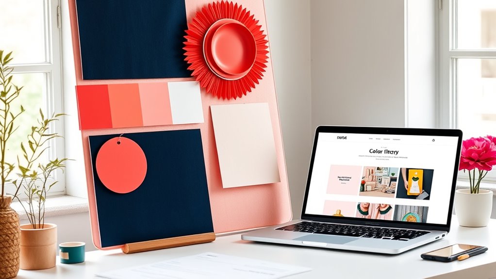
Have you ever noticed how brands use specific color combinations to evoke certain feelings or convey messages? For example, fast-food logos often combine red and yellow to stimulate appetite and create a sense of urgency. Tech companies might use blue and white to communicate trust and professionalism. In fashion, earthy tones like green, brown, and beige evoke naturalness and sustainability. Websites frequently utilize complementary colors, like orange and blue, to grab attention and improve readability. Retail packaging often employs analogous schemes, such as yellow, orange, and red, to evoke warmth and excitement. Minimalist designs lean toward monochromatic palettes, providing a sleek, cohesive look. By observing these real-world examples, you can see how strategic color combinations influence perceptions and behaviors effectively. Additionally, understanding the basics of color theory can help designers craft more harmonious and impactful color schemes.
Frequently Asked Questions
How Do I Choose Colors That Appeal to Specific Audiences?
To choose colors that appeal to specific audiences, consider their preferences, cultural meanings, and emotional responses. Use warm colors like red and orange to energize younger crowds or vibrant palettes for energetic brands. For more professional or calming audiences, opt for cool tones like blue and green. Think about the mood you want to evoke and select harmonious color combinations that resonate with your target demographic.
What Are Common Mistakes to Avoid When Combining Colors?
Like a painter avoiding muddy hues, you should steer clear of clashing colors that create visual chaos. Don’t overuse bright tones or neglect contrast, which can strain viewers’ eyes. Avoid pairing too many similar shades—this flattens your design. Resist ignoring color temperature differences; warm and cool tones need balance. Remember, harmony is key. When you stumble, your work loses its power—so practice mindful, deliberate color combinations.
How Does Lighting Affect Color Perception in Design?
Lighting plays a vital role in how you perceive colors in design. When you use different lighting conditions, colors can appear warmer, cooler, brighter, or duller. You should test your color choices under various lighting scenarios to guarantee they look consistent and appealing. Remember, natural light emphasizes true colors, while artificial light can shift hues, so always consider the lighting environment to create an effective, harmonious design.
Can Color Combinations Influence Brand Recognition?
You can greatly influence brand recognition through color combinations. When you choose colors that complement each other or align with your brand’s message, you evoke specific emotions and memories in your audience. Bold, consistent color schemes make your brand instantly recognizable and memorable. By understanding color harmony principles, you guarantee your combinations stand out and resonate emotionally, forging a strong visual identity that sticks with your customers.
How Do Cultural Differences Impact Color Symbolism and Choices?
Cultural differences considerably influence how you perceive and choose colors. You might associate red with luck and prosperity in China, but see it as danger or warning in Western cultures. Understanding these nuances helps you select appropriate colors for your audience, ensuring your message resonates. By considering cultural symbolism, you can craft designs that respect local meanings, making your branding more effective and culturally sensitive.
Conclusion
Now that you know the basics of color theory, you’re ready to make your designs pop and truly stand out. Remember, mastering color is like hitting two birds with one stone—balance and impact. Don’t be afraid to experiment and trust your eye. With practice, you’ll see your creative vision come to life. Keep pushing boundaries, and soon, you’ll be turning heads and winning hearts with every color combo you choose.